A look at Univeristy of California admission rates for Fort Bragg High School using Ipython.
Fort Bragg Admissions to UC Stats
By: John Naulty Jr Date: August 10, 2018 Data from UC Admissions Infocenter
Purpose
I wanted to look at any longitudinal trend in admission rates for Fort Bragg High School students to University of California universities.
I’ve manually downloaded a csv file from the UC Admissions Infocenter, linked above.
I was curious about hearing stories of the top students in the class of 2018 at FBHS not get accepted to many UC’s. What follows is brief outline of what I’ve found so far
Analytics
What does the data start to look like (post-filtering)
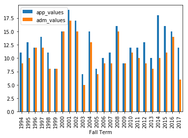
Let’s look at a comparison of Applied and Admitted per year
# all uc applied v admitted
uc_app_adm_plot=ultimate_sort(uc_all)
uc_app_adm_plot.plot.bar(x=fall_term)
What’s the Admission Percentage by year
# percent admitted per year
uc_app_adm_plot['perc_adm'] = (uc_app_adm_plot[adm_values] / uc_app_adm_plot[app_values]) * 100
uc_app_adm_plot[[fall_term, 'perc_adm']].plot.bar(x=fall_term)
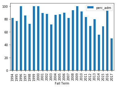
Admitted Percentage Greater than 80 Percent
.dataframe tbody tr th {
    vertical-align: top;
}

.dataframe thead th {
    text-align: right;
}
Admitted Percentage Less than 70 Percent
.dataframe tbody tr th {
    vertical-align: top;
}

.dataframe thead th {
    text-align: right;
}
Some Conclusionary Thoughts
            Putting things in perspective.

            Out of 24 years there were
            16 years where admissions were greater than 80%, and
            4 years where admissions were less than 70%
            Those low admission years are fairly recent.
            I wonder what the rates and trends are for other high schools.

            I wonder how Fort Bragg could improve these percentages,
            or if it's out of any high school's control.
Steps Forward
Moar Data There is a lot more data out there. There are a lot more csv’s to scrape. Documenting and building an automated tool for collecting this data, or contacting the UC InfoCenter and appealing/requesting easier access to the data might be a worthy venture.
Much Pretty It would be great to overlay this with geographical data. To make a heat map of cities, counties, and statewide admission rates per year. This would be a great visualization on it’s own.
Such Wow of course, I’m a tad bit rusty when it comes to statistical analysis :oh-no-face: I’d always be interested in getting advice/mentorship/help in the analysis of these data points. I’m curious what this information might tell us about the state of education in California. For me, that’s an interesting topic. And I would enjoy meeting other like-minded people.
Sharing <3 I’m going to a hack event in the morning. So I should share the work I’ve done. I’ll post the github link below.
below :)